Blog: Texas Rangers New Cap Fixes Bad Logo Issue
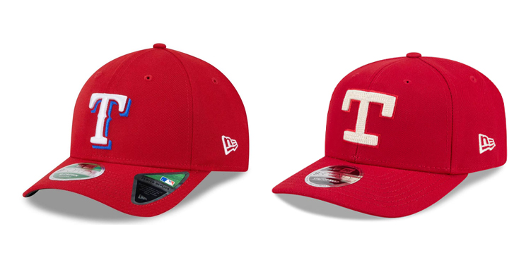
Well they did it. The Texas Rangers finally created a great looking cap. I originally wrote about my issues with the Rangers cap logo a few months back and now, with their new City Connect cap, they've finally designed a cap that I can approve of and want to wear.
Even though it's not their current T logo, they brought back the retro slab serif T used in the 70s and 80s. And then they practiced amazing restraint and only added a single, very subtle bright red/orange outline. The look is clean, bold and a substantially better looking cap than their outlined and drop shaddowed primary version!
Little by little I'm noticing a trend in sports back to a cleaner, less cluttered look. Less outlines, less overly stylized fonts and numerals, and reduced colors. In recent years the Minnesota Twins created one of my favorite new looks with no outlines at all! Their navy blue and red colors stand well on their own and the design has no need for outlines. Kudos!
Now, whether the Texas Rangers new City Connect look will inspire a change in their primary uniforms I don't know. But my hope is people withing the organzation, players, and fans, will notice this superior look and start the wheels in motion to move in this direction with subsequent uniform designs. Fingers crossed.
— Hovie Hawk
< Back to Blog